Ethical UX in E‑Commerce: A Guide to Clear, Inclusive, and Trustworthy Design
By Ellianys Pupo Restrepo
Graphic Design Capstone, University of Utah, 2026
Ellianys Restrepo
Feb 21, 2026
5 min read

Summary
Key Insights Overview
Analyze Hecha Asi Nails page to show how ethical UX improves readability, accessibility, and trust.
Readability & Accessibility: Low contrast reduces legibility; follow WCAG standards.
Avoid Manipulative Patterns: Transparent, honest messaging builds trust.
Authentic Content: Real user reviews and images increase credibility.
Inclusive UX: Design should be legible, understandable, accessible, and respectful.
Disclaimer: This project is part of a capstone project for the year 2026 under the guidance of the University of Utah. The information and opinions presented in this document are the sole responsibility of the author, Ellianys Pupo Restrepo. All data and information provided are for informational purposes only and are not intended as professional advice.
This article is a focused examination of the Hecha Asi Nails page from the Make It POP Framer project, analyzing how visual design and interaction choices affect readability, accessibility, and user trust — and how ethical UX principles can guide better digital experiences.
Introduction: Design That Looks Good vs. Design That Works
A beautiful interface may catch the eye, but beauty alone isn’t enough. Users expect clarity, usability, and honesty — especially in e‑commerce. When text, visuals, and interactions are unclear or misleading, the result is frustration, confusion, or loss of confidence in the product.
The Hecha Asi Nails page showcases an attractive layout, but closer inspection reveals usability challenges that we can learn from and improve upon.
1. Prioritize Readability and Accessibility
On the Hecha Asi Nails page, certain elements like the limited‑time “Ultimate Sale” header are difficult to read due to low visual contrast with the background. This may seem like an aesthetic choice, but it directly impacts accessibility and usability. According to accessibility standards like WCAG, text must have enough contrast with its background so users with visual impairments, and everyone else, can read it without strain.
Accessible typography and color contrast improve comprehension, help users navigate with confidence, and reflect respect for all user needs — not just stylistic trends.

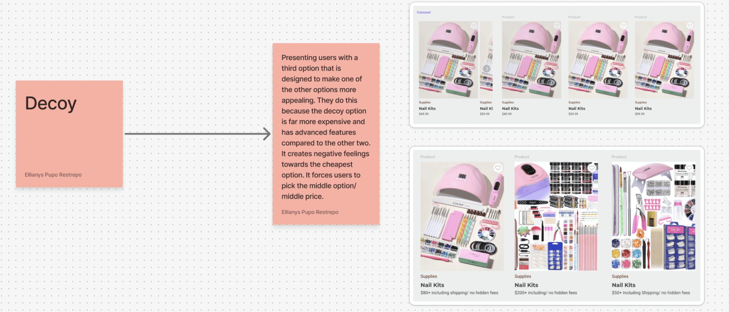
2. Minimizing Dark Patterns
Design should never trick users into purchases. Ethical UX avoids manipulation, prioritizing transparency and informed choice over short-term gains.


Carefully designed objects focused on form, usability, and manufacturable detail across modern consumer devices.